It may sometimes feel like magic. However there are definitely some assumptions and limitations as with any technology.
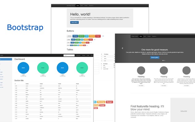
Bootstrap is a javascript\css framework created by developers of Twitter. It functions as a framework for responsive design of websites. Bottomline: it ensures that your website will look good on mobile devices as well as on desktop computers or tablets.
Bootstrap is a large framework with many components all designed to run within it's core grid system. The grid system handles how blocks are displayed in the website depending on the size of the viewport. Mobile devices have a different width and height than desktop pc's or tablets do. The gridsystem changes the existing lay-out to fit the viewport. If you have a two column layout, on a tablet the system will get rid of the empty space on the sides to fit the tablet size. On a mobile device it will put the columns under each other instead of next to each other. In this way users don't have to scroll horizontally to see the website on their mobile devices and they can still use it easily.
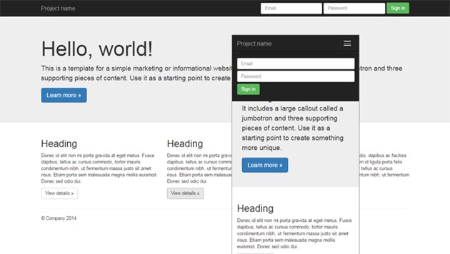
This all seems nice, but it does have some consequences on what you can and cannot do in your design and functional design. The design should be modular. For example: if you have two columns sharing one background this can become a problem if the background image is optimised to be displayed in landscape mode. On a mobile device you all of a sudden need a background image that is optimised to be displayed in a portrait mode instead of landscape, due to the repositioning of the columns resulting from the viewport differences. However with Bootstrap you can determine what html and images to display depending on the viewport size. That solves this design problem, but has two other nasty side effects. The first being: all html and images are loaded for both views regardless of the viewport. From a technical perspective this makes sense because javascript kicks in after the page has loaded and than determines what to show, but it does results in a longer page loadtime. The second being: you need more images than necessary for both displays. If users can configure these, than you need to make sure in your functional design that users understand this and can configure both images.
We discussed some effects that bootstrap can have on your design and functional design. In this light we can give the following advise. Prevent the usage of background images that do not have an aspect ratio of 1:1. Also be carefull with fixed block heights, margins and paddings. Rather use an equal amount of padding in your block of content to release empty space on the side, bottom and top. If you have to use fixed width than don't use one that goes over 768px, because this is the max mobile device width and your content will overflow the viewport horizontally on mobile devices. From a business perspective it's important to figure out how to streamline the content creation process and make sure there is some smart way of easilly adding the extra images, find some technical solution for that or find a way to work around that. Besides this I advise to put your primary focus on mobile first and make sure it loads quick and fast on mobile devices, maybe not use background images at all. Keeping in mind that the quicker your page loads the better it will be found in Google. After that, you can always optimise it's look and feel on desktops. However that is of lesser importance.